Considered leaders of a contemporary trend where sculpture and media art are of more architectural importance than function. The user experience inside spaces, which are - both in function and appearance- essentially augmented and changed by additional layers carrying information, media content and communication.
Location: New York
2007 - Temporary Installation
The installation offers visitors a couch and a TV showing several realities:united projects. Above this cozy setting hangs an arrangement of 14 standard industrial fluorescent lights forming a very simple digital display: as two seven-segment digits of a digital clock. The function of the room’s lighting is thus augmented—it is simultaneously a light sign, information carrier and light source. As an information carrier, the installation shows the current time in minutes. As a light installation, it is the only light source in the exhibition space. The installation’s controls continually synchronize the individual lights’
intensity, therefore keeping the space’s illumination constant while a changing numbers of lights is used to display the current time.
Location: Potsdamer Platz Berlin, Germany
2005 - Temporary timeframe
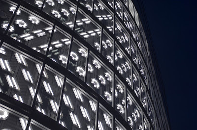
SPOTS was part of an internationally oriented marketing campaign for an untenanted office building on Potsdamer Platz, SPOTS aimed at a temporary, spectacular staging of the rather inconspicuous investor architecture, so that the greatest possible attention of international media would arouse the interest of potential tenants from afar.
Location: Singapore
2009 -
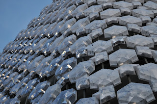
Crystal Mesh is a façade for the building complex “ILUMA” in Singapore.
It combines aspects of a conventional curtain façade with those of a light installation or monitor-façade. Crystal Mesh forms the building’s visual hull; the construction-physical functions are carried out by another exterior wall deeper inside.
Crystal Mesh consists of a tessellated pattern made of 3,000 modules of deep-drawn polycarbonate covering a façade area of more than 5,000 m2. About 1,900 of these modules contain a regular matrix of compact fluorescent light tubes forming “active patches” within the façade. At night the light matrix superimposes the idiosyncratic physical structure of the white, crystalline daytime façade. But the irregular arrangement of these patches—dividing the façade into areas with different resolutions—does not create a large, homogeneous screen in front of the building, but instead forms a more general impression of the building’s “media-ness” as a surplus to and an essential ingredient of its architecture.
2003
COMMUNICATIVE DISPLAY SKIN FOR THE KUNSTHAUS GRAZ
The idea of the media installation BIX arose out of considerations on how to equip the interior of the Kunsthaus in Graz with media (≥KMA). BIX was created as an additional feature at a time when overall planning of the Kunsthaus had already reached an advanced stage. In addition to the late date and technical complexity of the project, it was also a challenge to integrate an architectural concept of foreign authorship into the expressive building design by Peter Cook, Colin Fournier, and their Spacelab team. After all, BIX was a new element designed to entirely dominate the building’s riverside frontage, thereby radically redefining the architectural concept of the building’s skin. It received approval from the client and the architects because it was based on the architect’s original ideas for the sleek, blue, shimmering façade: Constructed from about 1,300 individually shaped, translucent Plexiglas panels covering the biomorphic building, the so-called skin was intended to feature different nuances of transparency, which would have created varying communicative relationships between interior and exterior. For both technical and budgetary reasons, the skin’s physical transparency had to be abandoned, degrading the material’s transparency into mere decoration.
The introduction of BIX revived the communicative conception of the façade, even if in a mediated way, at the same time delivering the required political arguments for the use of Plexiglas for the final construction of the skin. BIX consists of a matrix of 930 conventional circular fluorescent light tubes integrated into 900 square meters of the Plexiglas façade on the east side of the Kunsthaus. The individual, continuous adjustability of the lamps’ brightness with a frequency of 18 frames per second makes it possible to display images, films, and animations.
Location: Cordoba, Spain
2006
BUILDING FAÇADE WITH AN INTEGRATED LIGHT AND MEDIA INSTALLATION
The winning competition entry for the “Espacio de Creación Artística Contemporánea” by Nieto Sobejano Arquitectos proposed the integration of a low-resolution light and media façade on the building surface facing the Río Guadalquivir.
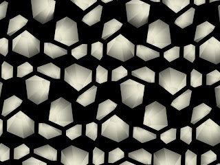
Subsequently realities:united was commissioned to further develop the conception and the design for this media skin in close cooperation with the architects. The starting point for C4 was an analysis of the significant inner structure of the building, which is made up of a tessellated (self-repeating) pattern of polygonal rooms. The inner motif is translated to form a characteristic outer topography on the façade. The surface is made of fiberglass-reinforced cement (GRC) and shows a system of irregular shaped indentations of varying density and size. Those “bowls”, which are geometrically derived from the building’s floor plan, are individually lit to become “pixels” of a large display system.
To transform the façade into a light and media display without fundamentally changing its solid appearance as envisioned by Nieto Sobejano turned out to be the biggest challenge in the project. The façade is accordingly designed to deliver a tactile and solid appearance in the daytime while it turns at night into a unique and dynamic communication wall that reacts very specifically to the architecture. The 100-meter façade consists of 1,319 hexagonal, recessed and pre-fabricated “bowls” on different scales. Each of the bowls serves as a reflector for an integrated artificial light source. The intensity of each lamp can be controlled individually, forming a huge irregular low-resolution grey scale display. The thorough immersion of the “pixel-bowls”—like negative impressions—in the volume of the façade turns the architectural scheme itself into a digital information carrier. During the day, the façade shows a three-dimensional landscape with no sign of being a media façade. Additionally, this tectonically modulated surface topography is characterized by a playful composition of light and shadow that constantly changes with the movement of the sun.
Three different scales of bowls are employed and
distributed in huge patterns over the total façade, thereby subtly echoing the building’s architectural elements. Additionally, each bowl appears to be unique in shape and size; and their distribution appears to be irregular. Only the distribution density stays consistent. Analogously to the eye’s retina, this composition allows the definition of areas of varying density or “sensitivity” on the façade. This analogy offers a certain artistic freedom: the resolution of the displayed images can stay low, fitting the blown-up scale of the screen, creating a mode of display in which the motifs are hinted at, rather than unambiguously presented.
Location: Hindenburgstr, Mönchengladbach, Germany
2006 - Temporary timeframe
MuseumX was conceived as a temporary installation in the former city theater of Mönchengladbach to act as a surrogate and social placeholder for the Museum Abteiberg (Fine Arts) while it was closed for reconstruction. The original project brief asked for an “urban sculpture as a reminder of the absent Museum.” The project went beyond the scope of an art object and started to look at the museum itself. Not a container for art, but a symbol for the ideal post-war modernist town—a sculpture on its own: a “museum as sculpture.“
It took just three comparatively small elements to turn the hulk of the 65,000 m3 structure of the city’s empty theater building into a simulated museum: a flag on the top of the building, a new foyer and a set of printed façade panels strapped in front of the theater’s façade from the 1950s. The façade of inkjet-printed textile panels showing a photograph of the exposed aggregate concrete façade of Werner Düttmann’s Academy of the Arts in Berlin—a well-known example of 1950s architecture in Germany—reproduced the image of a distinctive building of Post-war Modernism. This clearly discernable illusion of a cultural building
Location: Steeles Ave W / NW Gate, Toronto, Ontario, Canada
realized until 2014
INTERACTIVE ART AND LIGHTING INSTALLATION FOR A TORONTO SUBWAY STATION
realized until 2014
INTERACTIVE ART AND LIGHTING INSTALLATION FOR A TORONTO SUBWAY STATION
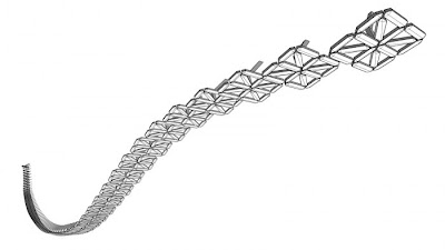
LightSpell is a light installation for one of Toronto’s new subway stations that are being realized until 2014. LightSpell is a “super sculpture”—a true hybrid between art installation and functional indoor lighting of the subway station. The installation consists of a suspended array with 62 fluorescent light chandeliers, each resembling a super-large “16-segment” display.
Each display is made of 16 individually controllable luminaries and can produce all letters of the alphabet, as well as special characters and numerals from 0 to 9. On the one hand, the installation will supply sufficient lighting for the station’s underground spaces, while at the same time it can display text messages created by the passengers waiting for their train using one of several keyboard terminals inside the station.
LightSpell is an experiment in public interaction and will entail various aspects of the theme of the freedom of the individual versus the interest of the larger group. Whatever individual message is projected, the installation will also deliver the necessary lighting for the entire station. It is a democratic installation: Any wording—however rude, stupid, offensive—will inevitably also be the light source serving the
demands of the community of other waiting people. Everyone is asked to overwrite, correct, or answer the existing message. Messages might be erased after 10 seconds or last weeks. Light and information, aesthetic and meaning, merge into one.
Information and Images from


No comments :
Post a Comment
Would you like to share something with us?